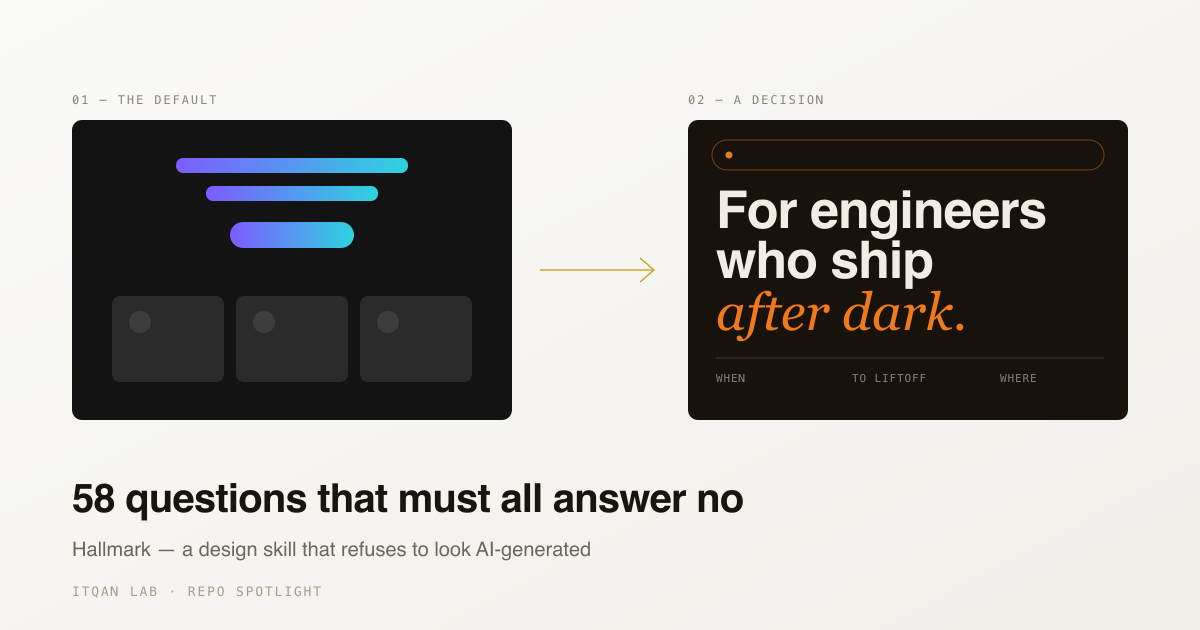
Ask any AI coding tool for a landing page and you already know what comes back. A centred hero with a gradient headline. Three feature cards below it, each with a rounded icon in a soft-tinted square. A pricing table with the middle tier highlighted. Indigo, or violet, or that one particular blue.
It is competent. It is also the same page, every time, for every product, in every industry. The model is not failing — it is doing exactly what it was trained to do, which is to produce the most probable answer. The most probable layout is the one that appeared most often in the training data, and that is the layout everyone else already shipped.
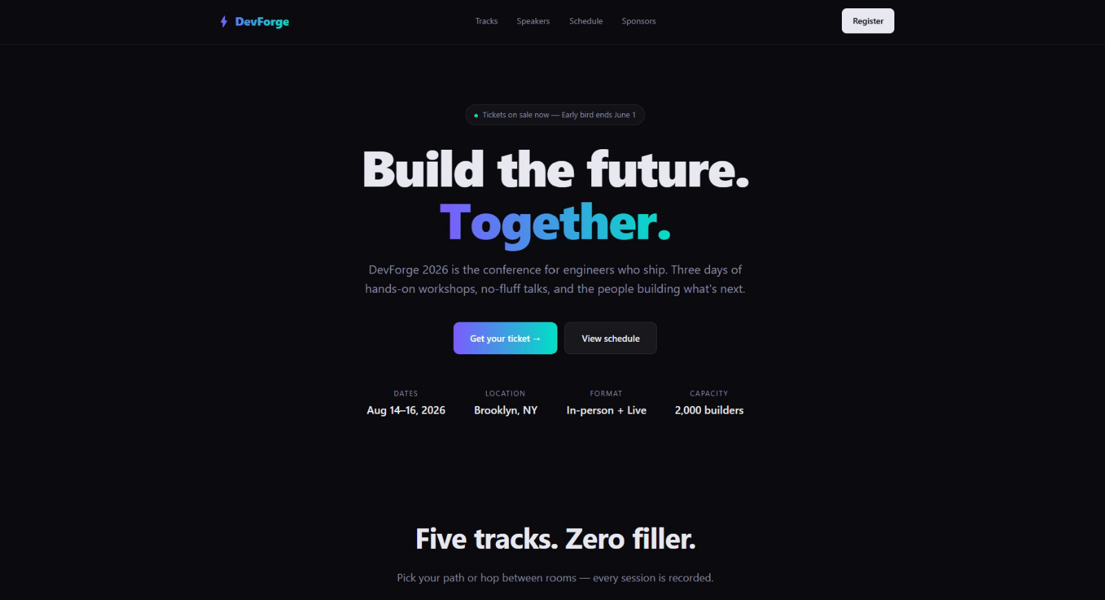 Generated from a plain brief. Every element of it is defensible, and you have seen all of them before.
Hallmark is a design skill built around that problem. Its own description is blunt: a design skill for Claude Code, Cursor, and Codex “that refuses to look AI-generated.”
What it actually is
Not a component library, not a renderer, not a model. It is a skill — a body of instructions and rules that installs into the editor’s skill directory and changes how the model approaches a design brief before it writes any markup.
npx skills add nutlope/hallmarkIt runs in four modes. Default builds new UI: it picks a macrostructure, applies the rule-set for
the active genre, and runs the gates before handing anything back. Audit reads existing code and returns
a punch list without touching it. Redesign restructures a layout while holding the copy,
information architecture and brand identity still. Study goes the other direction entirely —
point it at a design you admire and it extracts the DNA: macrostructure, type pairing, colour anchor,
and writes it out as a portable design.md you can hand to a different tool.
Behind those modes sits the part worth looking at: 21 macrostructures — bento grid, long document, marquee hero, manifesto, specimen, catalogue, letter, map-diagram — crossed with 4 genres (editorial, atmospheric, modern-minimal, playful) and a cookbook of 50 documented components in seven families. Four named themes ship on top of that (Carnival, Cobalt, Hum, Lumen), plus a Custom path that only engages when a brief shows real creative intent.
Here is the same brief, with the skill installed:
 Same brief, same model. The difference is a rule-set that refused the first answer.
The interesting part is the gates
The catalogue is not what makes this worth reading about. Plenty of projects ship theme collections.
What is unusual is that Hallmark inverts the usual instruction. Most design prompts tell a model what to produce. Hallmark spends most of its effort telling it what not to: 58 gates, each phrased as a question that must answer no.
They are refreshingly specific, and they sting:
Is the display font Inter, Roboto, Open Sans, Poppins, Lato, or a system default? Is there a purple-to-blue gradient anywhere — including a
background-clip: textgradient headline? Is there a 3-equal-column card grid with icon-above-heading tiles? Istransition-allused anywhere? Ishover:scale-105applied across multiple unrelated elements?
Anyone who has shipped a landing page in the last three years has shipped all five.
Before the gates run, a pre-emit self-critique scores the planned output 1–5 on six axes —
philosophy, hierarchy, execution, specificity, restraint, variety. Anything under 3 triggers a
revision pass before the gate sweep begins. The scores are then stamped into the file as a comment
(/* Hallmark · pre-emit critique: P5 H4 E5 S4 R5 V5 */) so a later run can find the weakness and
avoid repeating it.
The work is subtractive. It is a fence around the model’s most probable answer, on the theory that the probable answer is precisely the one that will look like everyone else’s.
That is a design philosophy, not a feature. And it is a familiar one — it is what a senior designer does when reviewing junior work. They rarely add. They remove the three things that make the piece look like every other piece.
Where it holds up, and where it does not
The honest read: this is a prompt-layer tool. It constrains what the model reaches for; it cannot guarantee what comes out. The generated design is still generated, and it still needs a human who knows the difference between distinctive and merely unusual.
There is a ceiling in the approach, and it is the obvious one: a rule-set that rotates between a fixed set of structures produces variety, not invention. Twenty-one macrostructures is a large number, but it is a number — the output stops looking like the default and starts looking like one of twenty-one. That is a real improvement and it is not the same as originality.
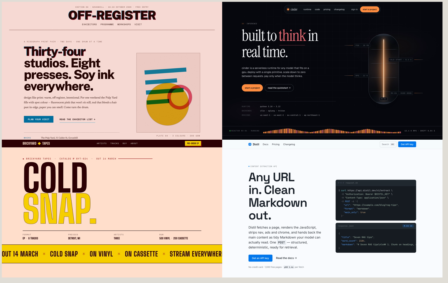 Four outputs, four structures. This is what “variety, not invention” looks like in practice — and it is a lot better than one template.
Hallmark has clearly thought about this, which is the most interesting thing in the repo. Gate 8
does not just ask whether the page looks like the generic AI template; it reads the file system for
a .hallmark/log.json and asks whether this build shares a structural fingerprint with the last
one in this same project — and it says explicitly to score by structural distance, not visual
distance, because a colour swap does not count as variety.
That is a variety ledger. The tool keeps a record of what it has already made so it cannot repeat itself. We run the same discipline over our own output, which is probably why it stood out.
Used with that understood, it earns its place. It moves the starting point from a blank prompt to a
considered structure, which is the part of a UI job that is slowest and least fun. The study mode
is arguably the most useful piece of the whole thing and the least discussed: being able to point at
a reference and get a written, portable articulation of why it works is valuable whether or not any
AI writes the final markup.
Why we are writing about it
إتقان means doing a thing properly — the standard where every detail was decided rather than defaulted to. A tool whose central claim is that defaults are the enemy is arguing the same position from the other end.
The lesson generalises past design. Every generative tool has a most-probable output, and the most probable output is always the average of what already exists. Getting something better out of one is mostly a matter of knowing which defaults to refuse, and being specific about what should stand in their place. Hallmark is that idea, written down as 58 questions and shipped under MIT.
Eighteen thousand stars in three months suggests the frustration it names was widely felt.
Repository: github.com/nutlope/hallmark